
I recently began to read more about the therapeutic benefits of art. Thanks to Noah Hass-Cohen’s book Art Therapy and Clinical Neuroscience, I became more grounded in the current research about art’s influence on the inner workings’ of the human brain. The Orbital Frontal Cortex (OFC) is “the pinnacle of emotional processing” in the brain. Art-making and looking at art engages the orbital frontal cortex and as a result inhibits limbic stress responses.
The inherent value conceived of in art therapy rests on the individual’s ability to engage in an exercise of expressing, releasing and regulating emotions retrieved by means of their links to colors and textures. Colors and textures draw forth deep seated memories and allow these experiences to be re-integrated by an individual in a more mindful understanding of their substance and meaning. The need for the use of color and texture as therapeutic tools arises from the inherent difficulty to articulate limbic emotions (that are triggered by stress, trauma and/or crisis) verbally. Since the advanced regulation of language lies in the cerebral cortex the ability to use words in times of crisis can be blocked because the cerebral cortex becomes inaccessible. Hence, the saying that someone is rendered speechless by an event has in fact a neurological basis. Thus it is by means of color, forms and textures that emotional information can be accessed in art therapy.
Although not crisis related, as far as I am aware, it is interesting to interject Kandinsky’s thoughts about the personal undertones that color played within his own art-making. Frankly these reflections shed more light on the cognitive integrative process concept for me as an artist.
For me, there are colors that have accompanied me all my life (mainly blue), others that operate as leitmotifs for some years or months (white, red, black, yellow), and yet others that nearly always take the form of accompanying elements only in exceptional cases play a leading role (red, green, violet). I love colors simultaneously in two different ways: with the eye (and other senses) and with the soul, i.e., for their content – one would be perfectly entitled to use today the prohibited word “symbolic”! (Kandinsky, The Psychology of the Productive Personality, 1929)
Kandinsky’s non-objective and less predictable arrangement of design elements in his artworks was noted in Hass-Cohen’s research as being the type of abstract art that activates the lower orbital frontal cortex. In this research a contrast was drawn between Kandinsky’s designs and those of Sonia Delaunay. The difference is interesting to me, because it appears that a more predictable and organized composition will activate the frontal areas of the orbital frontal cortex, and these have some corollaries with my own artwork, which I will comment on next.
Here are the examples:

Wassily Kandinsky’s art (Improvisation painting 1912)
© This artwork may be protected by copyright.
It is posted on the site in accordance with fair use principles

Sonia Delaunay’s “Rythme Couleur”
© This artwork may be protected by copyright.
It is posted on the site in accordance with fair use principles
From this perspective, I started to look at my own artwork and the variations between my geometric (expected) designs and my expressionistic (unexpected) design work. A salient characteristic that I immediately caught onto was an ongoing episodic shift in my stylistic predilection towards expressionistic kind of paintings during stressful times. It is likely that at these more intense moments I choose a form of painting that triggers or is triggered by the lower area of the orbital frontal cortex. While much of my day to day work centers on geometric abstract art that is clearly aligned with the frontal areas of the orbital frontal cortex and more structured and expected design combinations, I can now see how both of the distinctions described in Hass-Cohen’s research operate in my own work at different times.
It is easy for me to recall my expressionistic paintings, which involved the use of sanders, bristle brushes, gesso globs — and clearly were not in-line with a more meditative form of brushwork that I usually favor and employ while making geometric watercolor paintings. Here are two examples of this variability:
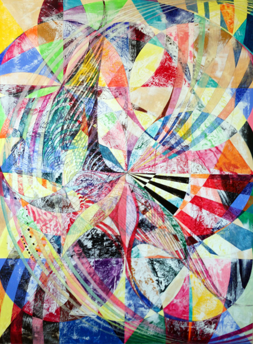
Expressionist
©2014 Lorien Suarez, All rights reserved.
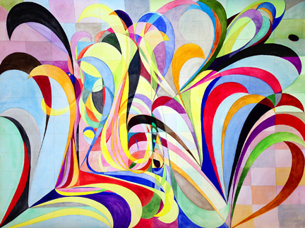
Geometric
©2014 Lorien Suarez, All rights reserved.
In future posts, I will revisit these subjects to reflect on how individuals and communities can benefit from the therapeutic effects that art stimulates. For now, it is heartening to see how viewing and creating art promotes healing and well-being through the natural responses that are activated neurologically. Art inherently draws forth a promising curative dynamism.

